Redesigning the NYC subway map
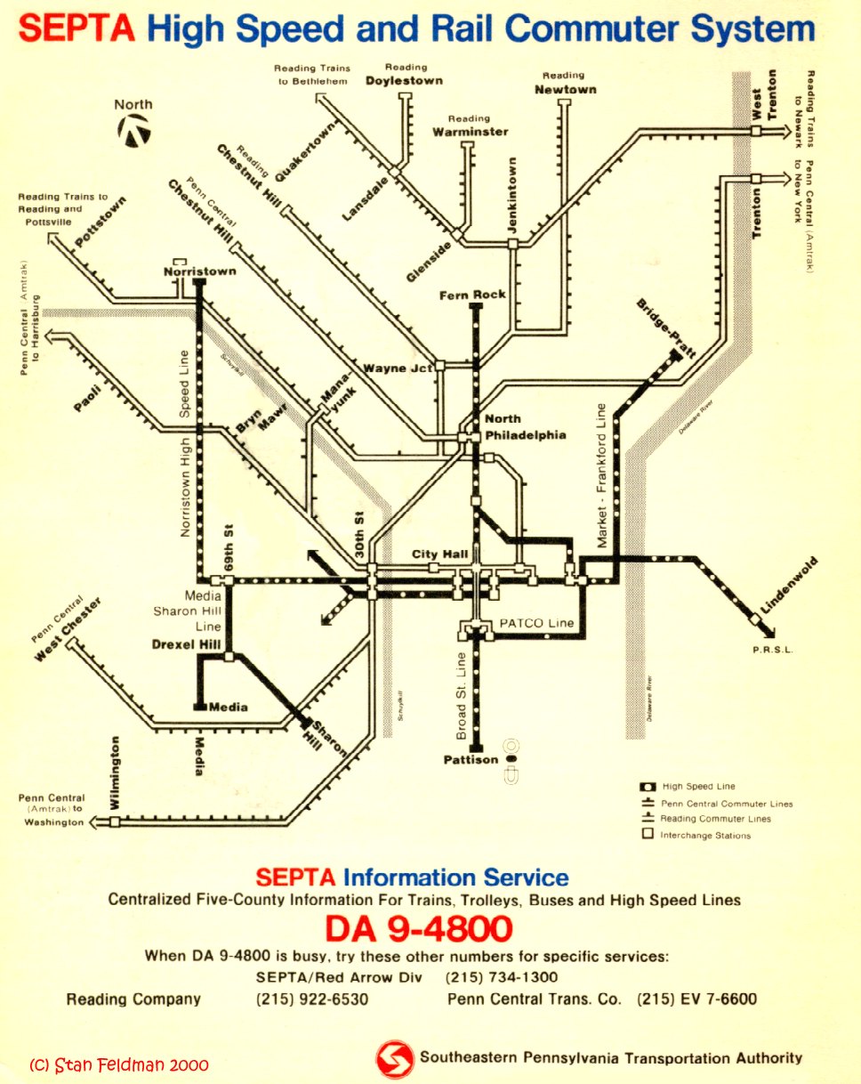
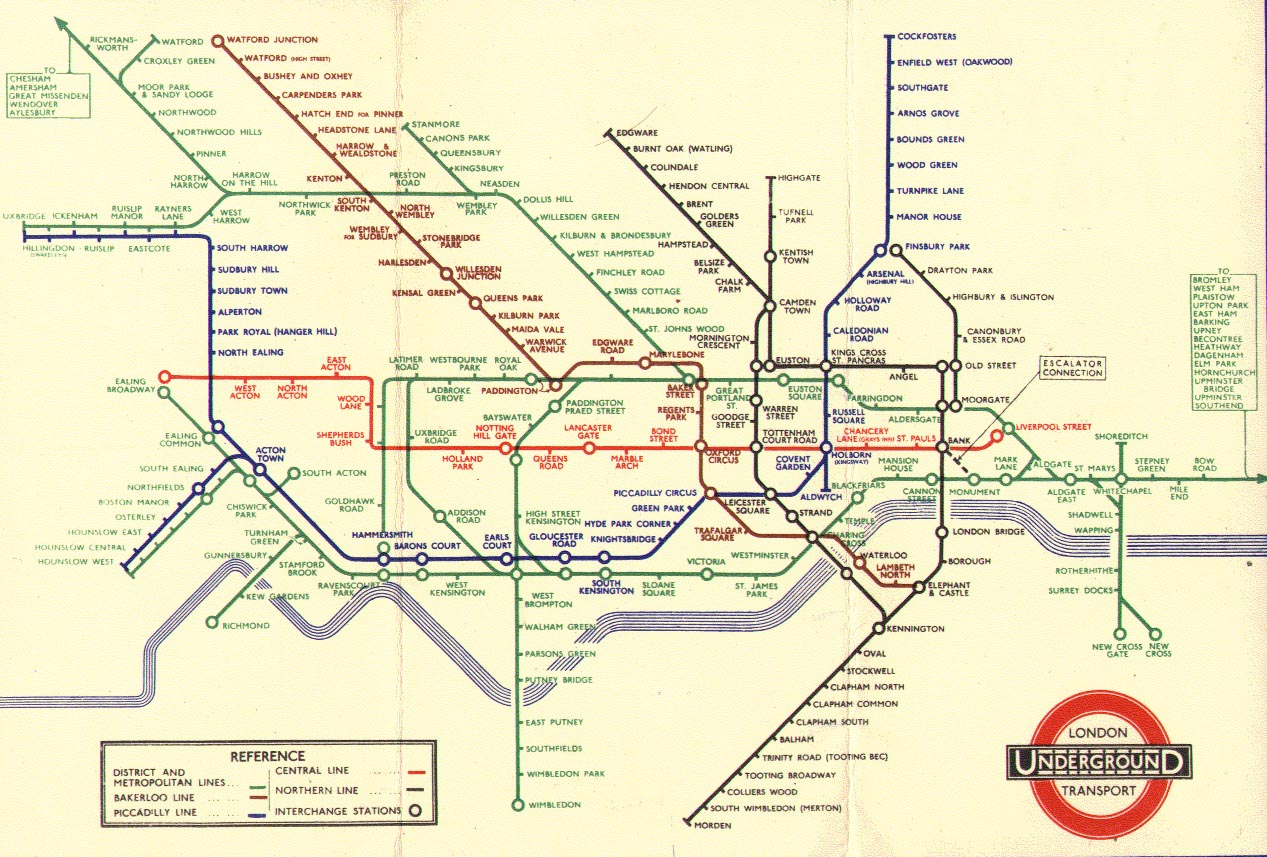
In rapid transit's slightly-more-than-100-year-history, it has been a rare occurrence to see a city redesign its subway or municipal transportation map. Philadelphia did so in 1976, when SEPTA was created by Conrail to operate suburban trains on the bankrupt Reading and Penn Central railroads, and in 1984, when SEPTA took over, routing all traffic through the Center City Commuter Tunnel and assigning "R" designation to all trains, resulting in the direct precursor to today's system map (some color had been added for the 1980 map). The London Underground's current map looks much the same as it did in 1938 excepting the addition of new lines; previously, they had used a more geographically correct model.
New York's three original companies originally disseminated their own maps, and following their unification in 1940 maps continued to group them by their competing divisions on a reasonably geographically-accurate map of the city. All that began to change in 1959, with the debut of George Salomon's highly stylized map, still grouping lines by division. Less than ten years later, maps were using a less stylized geographical background, but assigned each individual route its own color, the first such map appearing in 1967 (digitally reproduced here). Manhattan trunk lines were grouped by color starting in 1979 and a single-character limit was imposed on route designations in 1985, yielding a map nearly identical to today's.
And there's at least one person pushing for yet another dramatic change in the map's design. Eddie Jabbour of Kick Design has designed a new map, preserving color and route designations but showing each route as its own line on the map, disambiguating the local-vs.-express question that is unique to New York City (check him out at Signal vs. Noise, The Gothamist, or the three-year-old post at Live from the Third Rail that goes back to where it all started). Jabbour has even taken his map to the folks at the MTA, who acknowledge its aesthetic merits but do not see it as a necessary step to take.
Personally, I do like the new maps, visible in comparison here with the current scheme. The argument for geographical accuracy has little merit, considering how skewed the current map is already (the vertical center of Manhattan has been stretched to space the lines further apart, and don't even get me started on the incredible shrinking Staten Island). But, like the MTA, I'm not convinced that a new map is truly a necessity. At least, I've never felt hindered by the current map design. Outsiders to the system may indeed appreciate a more user-friendly approach--perhaps begin publishing maps in two flavors, even on a trial basis?--but it's important to remember as well that insiders to the system rarely feel any need to accommodate outsiders in the least.
posted by Ben @ 4:54 AM
![]()
![]()

1 Comments:
This is great info to know.
Post a Comment
<< Home